Why would a company refresh its brand? Sometimes you have to adapt because the world changes: markets and tastes are always moving targets. Sometimes it’s the company that shifts: your products or clients change, or your differentiation approach evolves. And sometimes it’s just because you want another swing at the ball – you want to do you a little bit better.
On the other hand, there’s always a drag on reinventing yourself: you risk throwing away some brand equity. A brand is a sort of mental handle that you put on the suitcase of your business. When your customers see your visual identity, when they hear your brand voice, when they feel your brand personality they recognize something – if they want to pull your services off the rack in their mind, they’ve got something they can grip it with – something that’s different than all the other bags on the rack. Changing this mental handle too often or too radically defeats the purpose of having a handle to begin with.
The Decision
Still, it had been four years since our last refresh, and we knew we needed it.
Our Art/Motion Director Carolina Mendez felt our logo was a bit dated. The rocket exhaust in our old logo created a swoosh, a graphical gesture that she felt had become tired over the years.
My own feeling was that we had probably gone a bit too serious in our last rebrand, back in 2016. At that time, we were moving from being a spunky start-up to an industry stalwart that served big name clients. We came out of that rebrand with orange and gray as colors; our font was Raleway. Like most B2B companies, we didn’t want to seem frivolous or flighty; we wanted to project reliability and professionalism. However, looking back we probably over-adjusted in the tonal shift. When people are buying animation they are looking for a bit of fun. They want to have an invigorating creative experience; button-down is not what draws them in.
Finding a Partner
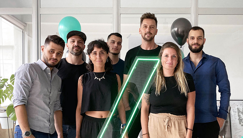
We searched for a Graphic Design partner in Buenos Aires, where our production team is located. It wasn’t just because we could get more affordable services there; we also suspected that the Argentine graphical sensibility was more likely to be fresh and daring than the US studios we had considered on our 2016 go-round. We looked at the portfolios of twelve different design studios in Buenos Aires, but we ended up talking to only one: Estudio NK. They had the sensibility we were looking for: daring, modern, clean. They also happened to be based in the same BA neighborhood as us in Palermo, so we took a stroll over to their office, met Lucas Nikitczuk and his team, and decided to contract them for the rebrand.
We wanted to re-do basically everything: logo and visual identity, design and development on a new website, social media collateral, stationery and brand book. We wanted to look fresher and more fun, but still keep the thread of our brand going.
The Visual Identity Fundamentals
We started with our brand colors. We wanted to keep orange because it suggests a rocket exhaust and represents stimulation and enthusiasm. Nevertheless, we were open to broadening our orange-and-gray palette. Estudio NK suggested we keep the orange and add a complementary blue, to communicate dependability without being drab. They made these colors brighter and bolder. And they made the gray much darker – nearly black – so the colors could pop off it.
Next, we chose readable and contemporary sans serifs typefaces our new brand identity: Centra No. 2 for titles and Avenir for body text.
Logo Redesign
Knowing the importance of logo design, we always expected this to be the toughest nut to crack because we had a number of requirements:
- We wanted to keep the rocket iconography.
- We wanted to keep the modernist bent of the typography.
- We wanted a logo that included both the brand name and an extractable icon that could live as an avatar on social media sites and elsewhere.
Over the years, we had worked with a number of graphic designers on a new logo but failed to find something we preferred over what we had. I prepared myself (and Estudio NK) for the possibility that we simply wouldn’t find a logo we liked and we’d just keep the one we had; I told them I hoped this wouldn’t discourage them. This premature letting-them-down-easy amused the people at Estudio NK immensely. In the end, I believe they met the ask extremely well.
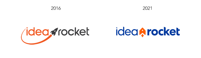
The typeface has the same circle-based construction. The rocket is in the same place on the logo. What’s new is a thinner weight for ‘idea’ and a thicker weight for ‘rocket,’ and oblique-ended ascenders on the k, t, d and the dot of the i. The new design provides exactly what we hoped for: a fresher, more contemporary look that maintains a lot of the established brand equity.
The Website
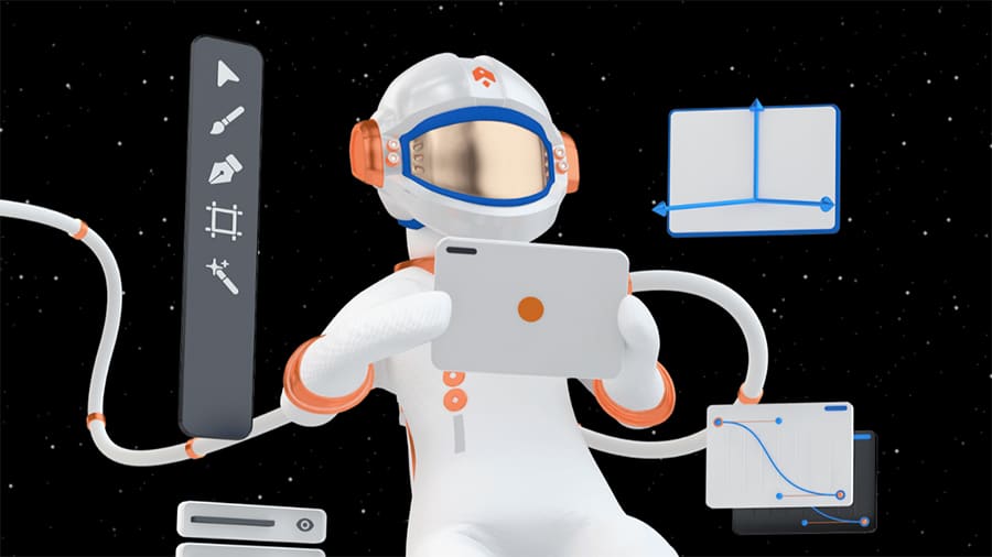
One of the first questions that pops up when you’re working on a website is the illustrative style. What will accompany the text? Just icons? Photos? Drawn illustrations? We decided to go with 3D images that would differentiate the site from the countless iterations of cookie-cutter templates, and we complemented this with boldly set type and a simple icon style. Tonally, the site has a light-over-dark feeling of outer space.
An important choice was to introduce a character in a space suit… let’s call him/her the Rocketeer. By tinting the face shield we gave the character an air of mystery and cool, as well as non-descript gender and ethnicity. Here is the final page of our PowerPoint presentation template:
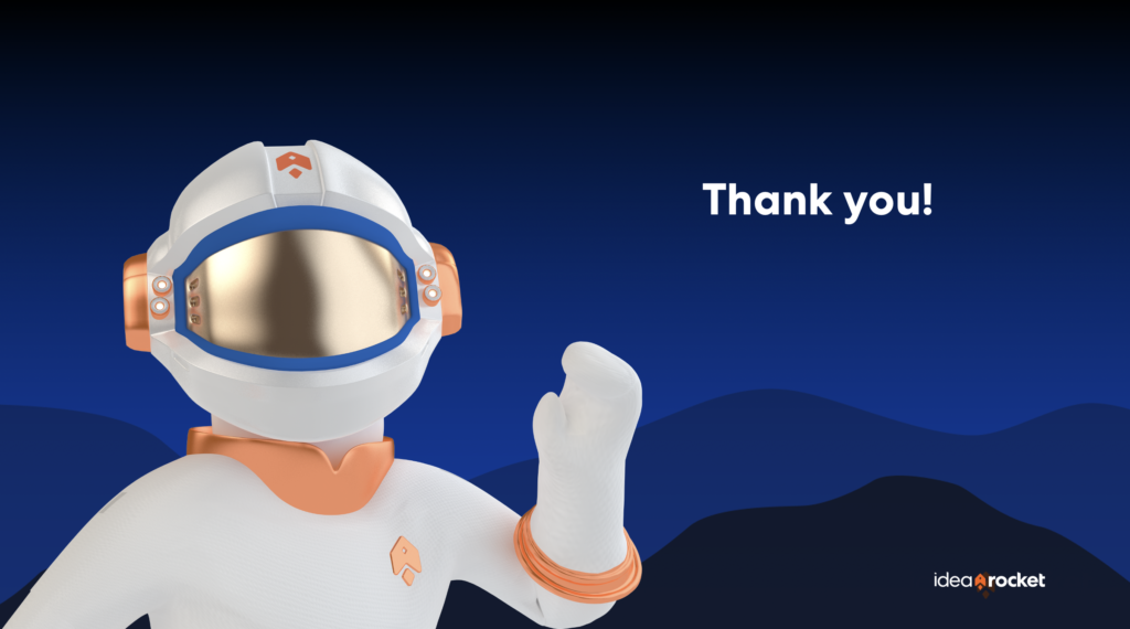
We are hoping to bring the Rocketeer into our animation world and do some videos with him in the future.
New Brand Videos
Speaking of videos, the first promotional video we created was in 2012 and was called Introducing IdeaRocket. It has been seen more than 100,000 times. When we introduced this video, our conversion rate jumped dramatically by 38%. The video has served us very well, but it has been getting stale so we wanted to create something that was a little less salesy and a little more poetic, more emblematic of our brand ethos. Working with designer Juan Barabini we created Kite – a meditation on time, creativity and the relationship between artist and client.
We also wanted to tell our brand story in a more distinct and relatable way. As the Founder of the company, I’ve kept in the background most of the time, but I’ve come to appreciate that the IdeaRocket story is hard to separate from my story. And that my story, with its world-trotting path and unusual turns, is one that interests people. So we created Our Founder’s Story.
Differentiators
A brand is more than just logos and typefaces and colors and cool collateral. It’s a differentiating statement. The last time we thought deeply about this, we polled our past clients about what made us different. They said that we were very good at explaining complicated concepts in a clear and concise way.
That might be a truthful statement, but it was also something that many of our competitors also said about themselves. This time around, we’ve added two statements that are more distinct and difficult for others to claim.
- IdeaRocket is the only US-based animation studio with a permanent production facility in Buenos Aires. And…
- IdeaRocket is an employee-owned company. All our permanent personnel, whether they live in US or Argentina, are part-owners of the company.
We’re proud of these two things and we think they give us a competitive edge. By having a presence in both Argentina and the US, we can provide our customers with culturally fluent creative direction, writing and client liaison, and combine that with superior quality and value in our productions. And by being employee-owned, we can make sure that all our personnel has an intimate interest in our clients’ success.
Is your company thinking of a brand refresh? Have you gone through one recently? We are happy to hear your stories or lend a hand.