It’s the character design style that creatives love to hate. Corporate Memphis became a ubiquitous part of the marketing landscape in the 2010’s. Every corporation from Google to the London Transportation System embraced this style of design. Now, pundits are gleefully declaring that Corporate Memphis is dead.
Like Mark Twain, the demise of Corporate Memphis may just be an exaggeration. Familiar bendy limbed characters still pop up now and then. So, what does the death, or not, of the big tech art style mean for design?
What is Corporate Memphis?
If you were alive and online in the last ten years, you’ve almost certainly seen this corporate artstyle in action. Corporate Memphis is a style of character design marked by:
- Flat 2D vectorized illustrations or animations
- Exaggerated proportions (long legs, big hands, tiny heads)
- Basic geometric style, with no shading or textures
- Stylized, iconic backgrounds
The characters are almost always active and joyful. They run, jump, and smile as they collaborate on their computers and smartphones.
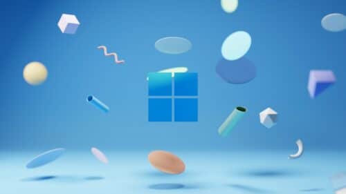
The design was likely in the zeitgeist before the mid 2010s, but it reached the masses in 2017 when the media agency called Buck created a custom animated and illustration design style for Facebook. They called it Alegria. And pretty soon, everyone was mimicking the aesthetic.
The name Corporate Memphis is credited to Mike Merrill, who was reminded of the Italian design and architecture group known as Memphis.
Whatever you call it, this style quickly became the go-to way for tech companies to seem modern and playful. Which sounds lovely until you realize how many people really hate this character design style.
Why do people Hate Corporate Memphis?
Illustrator and YouTuber, Struthless, created a video with more than 160 thousand views that called Corporate Memphis “the world’s most hated art style.”
In a piece for Creative Bloq, Nathan Fear wrote that, “It represents everyone and speaks to no one.”
All of that vitriol isn’t really aimed at the style itself, which was actually pretty effective in its day. The real issue is the oversaturation. Within a few years, this corporate art style was everywhere.
Writing for London content agency, Highbrook, Lark Knutsen called it the “design style that ate the world.”
It was simple, clean, and easy to replicate. The characters were racially ambiguous – often with blue, pink, or green skin and equally unnatural hair colors. It was basically the illustrated version of stock imagery, and you could make it with simple design software. Why wouldn’t brands embrace it?
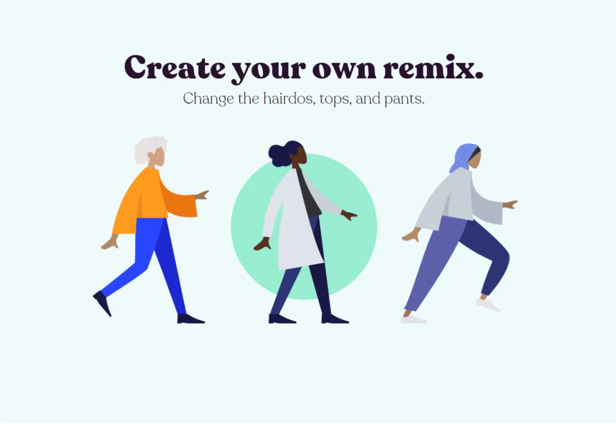
Some enterprising designers even released stock image libraries that let brands mix and match character elements. The one pictured below come from the Hummaaans website by Pablo Stanley.
But, much like Beanie Babies in the early 2000’s, Corporate Memphis’ popularity hastened its downfall. It became so pervasive as to be meaningless, fading into the background like the sound of traffic outside your window.
It’s even achieved meme status. Twitter (now X) user @clayohr juxtaposed the light, playful style with the dark and disturbing art of Hieronymus Bosch.
Artists and graphic designers feared what Corporate Memphis signaled about the tech industry, its respect for their jobs and their creativity. In some ways, this style was the herald that came before the crushing threat of AI.
So, is Corporate Memphis Dead?
Not quite. It’s true that Memphis-style character designs are quietly disappearing from many websites. They’re being replaced by 2.5D multiplaned styles or colorful screenshots. Other brands are still using clear derivatives. The ad below from Bluehost is just one example.

But in design, nothing ever really dies. It just evolves. Every trend informs the styles that grow out of it. Corporate Memphis isn’t dead. It just went underground. You can see it in the simplified style of your smartphone app icons and the flattening of websites everywhere.
Maybe, rather than writing obituaries for Corporate Memphis, we should reflect on how it can best be used. Corporate Memphis still works as colorful filler. It’s a way to break up text and present simple ideas visually.
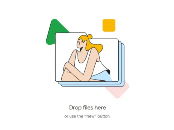
For example, Google Drive uses the graphic below to prevent the user from skipping past the simple directions for creating a new file.
If you need to represent your brand, to build relationships with viewers, or tell a compelling story you might want to look for something with a little more personality. Alegria means joy, so the corporate art style doesn’t really do pathos. Conflict, challenges, and pain points are suspiciously absent from the frame.
If you want to tell a story with a conflict and a hero, or if you want to relate to a specific person in a specific time and place, there are other 2D design styles much better suited to your goals. Look for a graphic designer, illustrator or animator with the vision to tell your story.
At IdeaRocket, we create custom animations that help brands launch their message into orbit. We don’t want your brand to look like everyone else’s, we want to help you stand out and share your unique story. Contact us to get started.